Evolution of the SHELL logo
Over 110 years, the SHELL logo has moved from a weird shape watermelon to one of history’s most famous pecten.
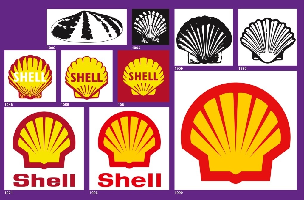
It was the year 1948 when Shell introduced its famous red and yellow colours to their design, not only because it makes the logo stand out, the two colours also represent Spain, where many early Californian settlers were born. Perhaps by displaying Spanish colours it was hoped an emotional bond would be created.
In 1971, the company felt its emblem was difficult to distinguish from a distance and wanted a rebrand. It’s when designer Raymond Loewy (1893 – 1986) came up with this bolder, cleaner image discarded by its unifying bolder. Loewy’s design has become so recognisable, the only element ever changed after 20 years since his original design was the brightness of the red and yellow.
The one from 1961 is my personal favourite, what about you?